Finding the Feature: One Swipe
Food logging has it all: interesting engineering problems involving database design and search, paradoxes about how to guide and motivate a user, and tricky UI design to boot. But what to focus on?
When I started working on Noom’s food logging experience with the Owls team last year, we really wanted to improve this central Noom experience in a significant way. At the time, we were having these problems:
- Logging food is meticulous and slow, so it turns people off. This is true whether you’re using a paper and pen, Google search, or Noom. It gets even more frustrating when you log the same 5-ingredient breakfast over and over.
- Users can’t find what they want to log. This problem has dozens of subproblems, from spelling mistakes to idiosyncratic food choices to homemade meals for which the nutritional information doesn’t exist … but users tend to lump all of these problems together into “I can’t find it.”
- Users want Noom to guide them toward better food choices, but not too much. Generic advice like “add vegetables to your plate” and “cut sugary drinks” only goes so far. In order for dietary changes to last, they need to fit the user’s everyday habits.
We took a deep breath and tackled problem #1 first. The Owls tech lead, Mark, had an idea: what if we used the foods the user has already logged in this meal to predict the next ones? He spent a hackathon working on it and created a search list that suggested dressing if you logged salad and got better over time. Our intern, Bo, helped carry this hackathon project over the finish line by productionizing this awesome idea. We called it the Food Oracle, and it was a sensation.
Next, we started thinking about a related problem: portions. Not only do I eat pretty much the same breakfast every day; I eat similar portions each day, too. The data confirmed that most users aren’t so different from me. When a typical user logged the same food at least 5 times, two-thirds of those logs were the same portion. Armed with data and intuition, an idea began to take shape: what if we created a “fast lane” for logging a common food-portion combo?
The next step was figuring out exactly how this “one-click logging” should work. Our designer Youngin dug into the problem, trying out a variety of options…
As usual, this process brought up questions we hadn’t thought about before:
- What’s the best way to show that “one-click” was available?
- Is a swiping interaction discoverable enough? Do our users feel comfortable with swiping?
- How do we show feedback when the user logs an item? We tried marking the item in the list and showing each logged item at the top of the screen.
- Should we support edge cases like deleting an item or logging the 2nd most popular portion size?
These questions helped clarify our original goal. We decided we wanted to make logging faster for “expert” loggers without changing the experience for other users. With this in mind, we avoided adding buttons or additional functionality.
At this point, the internal name of this feature became “one swipe,” and we began figuring out whether a) users could find one swipe and b) users would figure out what it did. And for that, we turned to a trusty standby: usability testing, spearheaded by our GTKOU (Get To Know Our Users) team. Coding animations takes time, so Youngin made a couple of videos, and GTKOU did their magic.
After a couple of usability tests, we had learned:
- No one noticed the grab bars we put on the left of food items to show that the user could pull them to the right.
- Once a user saw swiping demonstrated, she got excited — it was clearly a delightful action.
- We needed to link the swipe to an increment in the number of items logged. When this happened, users understood how and why to use one swipe. Unfortunately, only 1 out of 4 users made this connection.
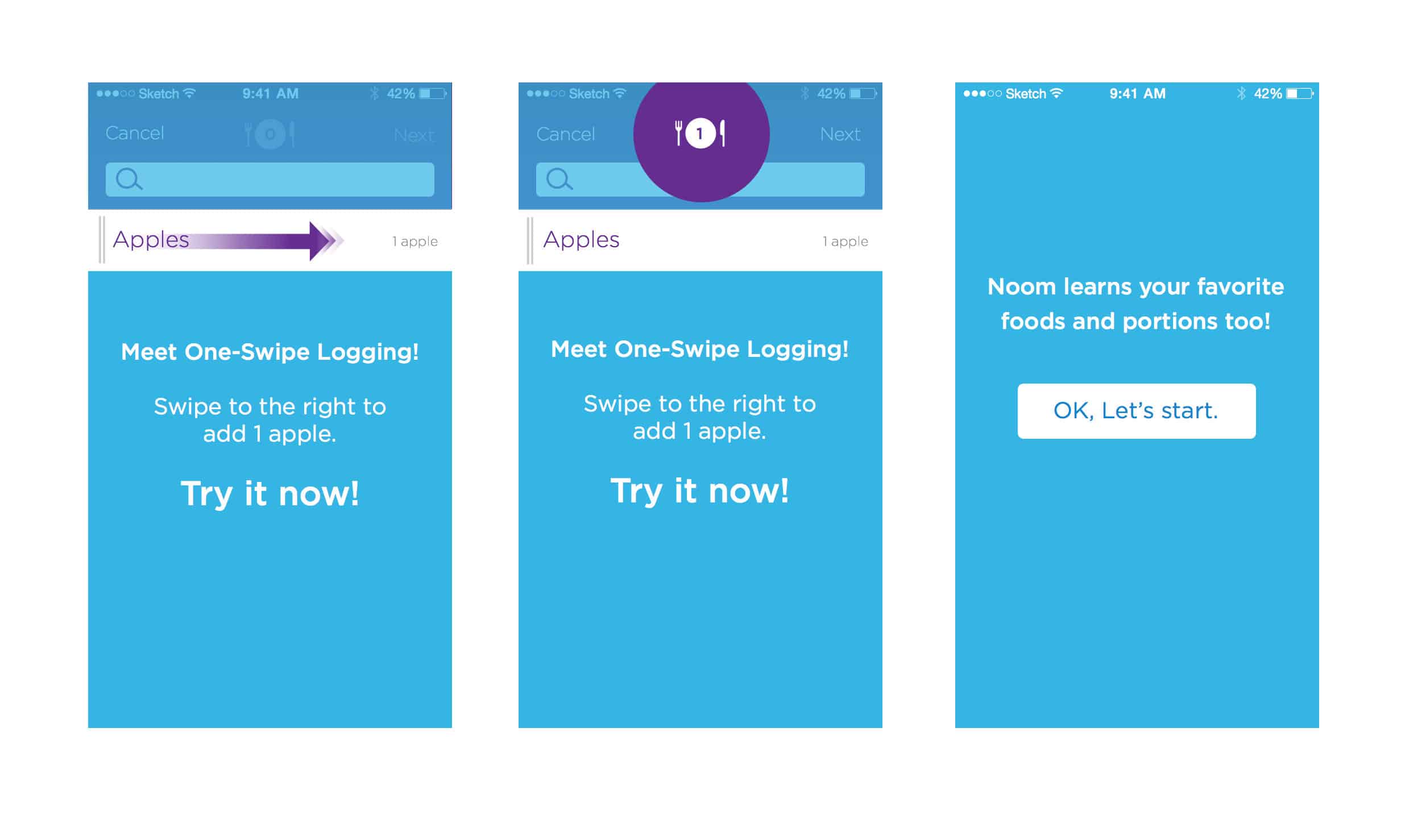
We emphasized the cart increment animation and saw good results right away. Given that users liked and understood it once they used it, we tackled the last thorny problem: discoverability. “Easy!” we thought, “We’ll do an interactive tutorial!” It looked like this:

The usability tests came back… OK. Users swiped to log, and could be prompted to swipe again after the tutorial. But the tone of the responses was worrying. “I didn’t want to log an apple!” they’d say, or, “Phew! we’re back,” after exiting the tutorial. After weeks of iteration, we scratched our heads, shrugged, crossed our fingers, and shipped anyway.
One Swipe and the Food Oracle came out at the same time, and our expert users responded immediately by boosting our food logging happiness scores. A success! But we still wondered about that tutorial. Was there a way to introduce experts to food logging without confusing people who wanted to log the way they always had?
After a couple of weeks, Youngin came up with an idea: skip the text and forced interaction, and use a “jumping” animation instead. It looked like this:
Jackpot! Usability tests showed that the animation introduced experts to One Swipe without annoying new users. It also let us fulfill a user request to see the Noom color of the food in search – something that had been requested for months.
Tiny things aren’t easy. In fact, a simple swipe can take a long time, a lot of usability tests, some head scratching, and several iterations to get right. But every time I use One Swipe and the Food Oracle, watch a food logging demo, or witness another user discovering the swipe, I smile and think “we did a pretty good job there.” And that’s what it’s all about.
